UI/UX Design
Interfaces for products and applications, where the measure is whether someone finishes the task — not whether the screen looks good in a portfolio.

The problem
Internal tools are usually designed by whoever built them, so they mirror the database rather than the job. Staff learn the workarounds, and the cost shows up as training time and quiet errors.
Our approach
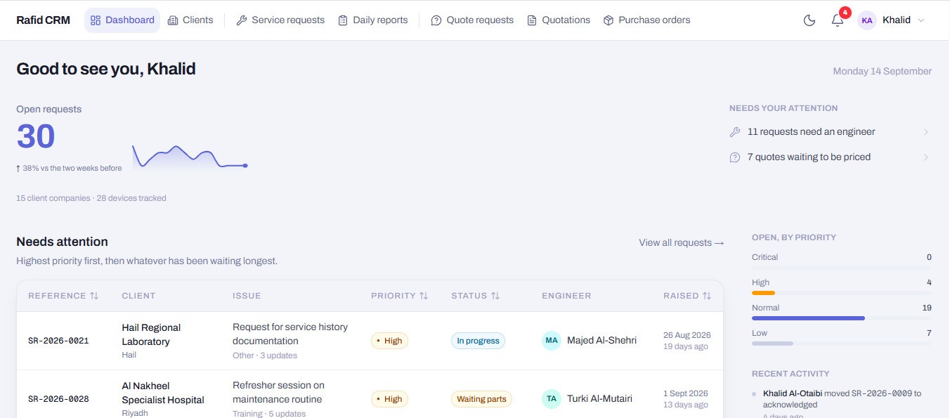
Start from the flows people actually repeat, then design the density those flows need. Status carried by a shape and a word, never colour alone — a list of forty rows should be readable at a glance, and still work for someone who cannot distinguish red from green.
What's included
- Flows, wireframes and information architecture
- Interface design for dashboards, portals and admin tools
- Component libraries your developers can build against
- Forms that validate on blur and recover from error
- WCAG AA contrast, keyboard paths and focus order
How it runs
- 01
Observe
What the work actually is, before deciding what the screen should be.
- 02
Structure
Flows and hierarchy, agreed before a single pixel.
- 03
Design
Screens, states, and the empty and error cases nobody remembers.
- 04
Test
Walk the real tasks, at real density, with real volumes.
Where we've done this
Questions
Do you only design, or build too?
Both. Design that is never built is a document, and we would rather own the result than hand over a file.
Can you work with our existing developers?
Yes. We hand over a component library and specifications rather than flat images.
Is accessibility extra?
No. Contrast, keyboard access and focus order are part of the work, not a line item.
Start with a conversation
Tell us what you need and we'll come back with scope, timeline and a number — not a brochure.